UX Case Study:
Food Court Interactive Menus
Overview
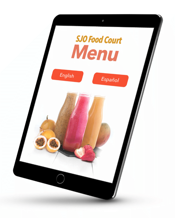
This is an actual project of a common, interactive food court menu using smart tablets to manage display, user choice and payment duties, to be implemented on restaurants and franchises of the project's client on Costa Rica's main airport. For confidentiality reasons all traceable identities have been withheld.
Challenges
Given the controlled space that a post-security waiting area offers such as that of airports, the challenges to make this work were rather low; however, Wifi reliability (which tablet’s location services depended on) could be spotty in some places. Thus, the offering of the service rather than making it area-wide was concentrated on a few designated spots around the airport’s gate areas, and also to avoid involuntary or intentional stealing of the tablet equipment.
Goals
- Offer convenience to in-transit passengers wanting a nice meal but without knowledge of where the main food court is located, not wanting to stray too far from their flight gate, or purchasing food for in-flight consumption.
- Offer bilingual (English-Spanish) menu choices to cover the vast majority of in-transit passengers.
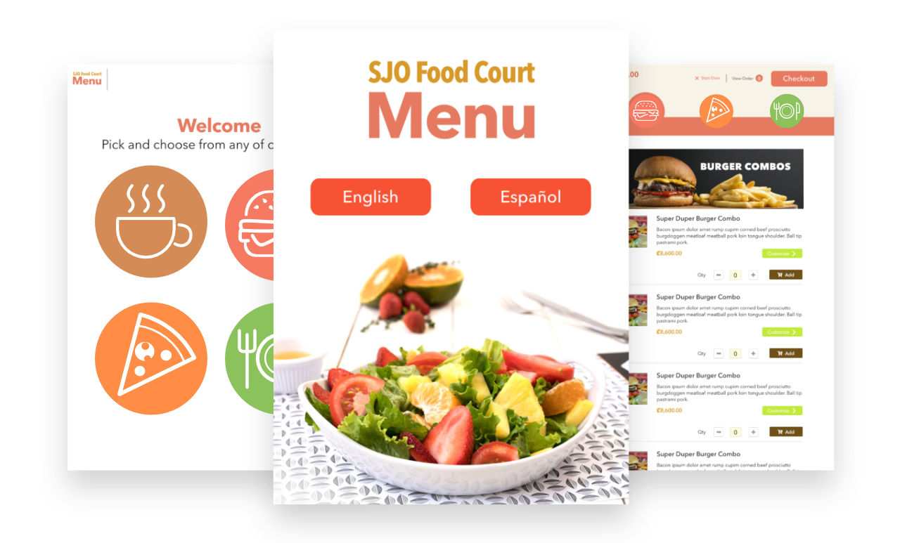
- Present menu choices in an attractive, clear, intuitive, stress-free fashion, considering the limited time, stress and environment unfamiliarity constraints most passengers experience on airport layovers or departures.
- On the backend side, unificate all sales reports on a centralized, easier to track database system.
- While this project was started with four brands, room to include more operations over time was heavily considered.
Target Audience
Frequent travel customers aged 25-65, traveling within the Latin American region airports where client's retail store operations are located.
For target personae information, refer to the Traveler Rewards Loyalty Program use case.
Scope and Constraints
From a technical standpoint, scope was a limited and controlled one as this app was not intended to be used beyond airport boundaries and with a single tablet model in line (of the Samsung Galaxy series type) so development, testing, debugging and delivery could all be done as fast as possible. This also lowered the design times as responsive adaptations didn’t have to be considered.
Personal Roles
Being both the UX and graphic designer in charge, I took on these development roles as part of the client's in-house development team.
Design
Given the reduced scope of the project, defined by:
- A focused app with a single purpose (show menu choices and delivery)
- Single aspect ratio
- Made to work on a controlled environment (airport lounge zone)
Most design decisions were set around these key factors:
- How to make the shopping experience as fast and intuitive as possible (the “Don’t make me think” philosophy)
- Detect and reduce pain/friction points as much as possible, specially at the payment stage
- Reassure the prospective customer of the convenience and value of this approach
- How to retain customer loyalty in an environment where fleeting, non-repeating passengers are the norm rather than the exception (this being a tie-in with the rewards loyalty program)
Selecting Options
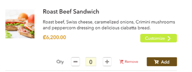
We wanted to offer customization in some options, so in orders like select sandwiches the customer could choose to add (or subtract) extra ingredients.
The Customize button allows to reveal additional options
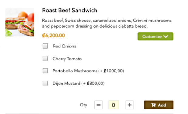
Additional customizing options revealed
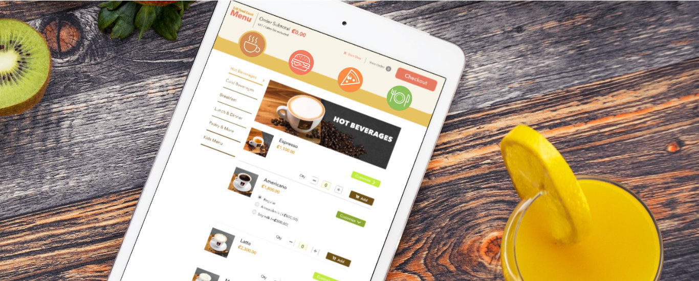
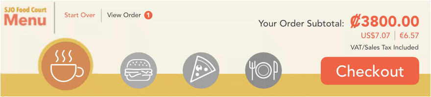
Invoicing
On the top of the app UI, the order subtotal and basic options were always visible, together with a big call-to-action “Checkout” button. On hindsight, as much as it was important to show the customer all available options (cafeteria, burgers, pizza, sandwiches) I would have moved or desaturated the logos except for the currently selected option so the “Checkout” button didn’t get lost, and choose a more outstanding, complimentary color to it.
The original menu layout
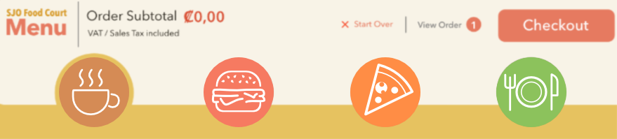
Alternate rearrangement for better action flow (unselected alternatives grayed out)
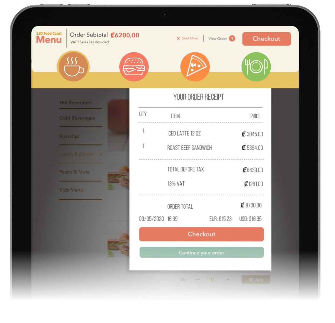
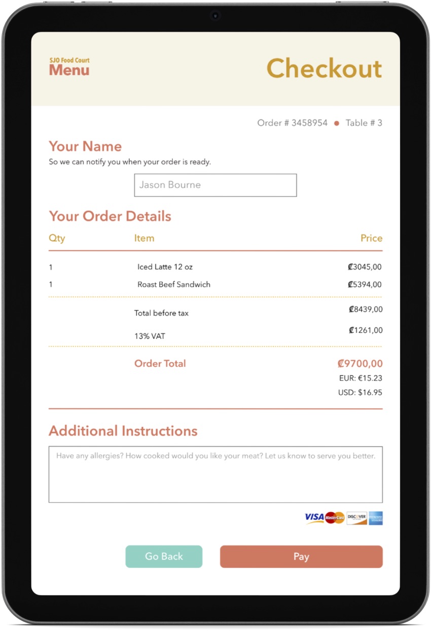
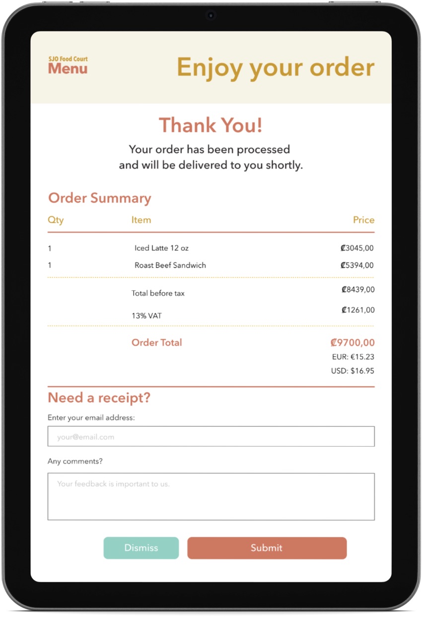
Upon selecting “Checkout”, the customer gets presented with a traditional style receipt (a little concession to skeuomorphism) detailing in clear and wide manner the order items, its total in Costa Rican colones and their equivalent in euros and US dollars, using the client’s existing POS structure for processing and invoicing, in integration with this system. From here, the customer had the option to go back and continue/edit their order, but we chose to prioritize visually the completion of the checkout process.
Payment
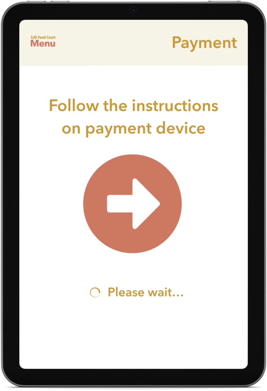
In retrospect, this is where I detect a main pain point that did go unsolved. It was decided that the tablets showing these menus were to be put alongside ordinary POS terminals so customers could complete the paying process using their own credit cards. This was before NFC and Apple/Google Pay options were commonplace. Also, another tension point was found at the completion of payment as there was no longer feedback sent to the user until the order was effectively delivered, which had to be in a matter of minutes. Giving the user some feedback on this regard, as in a timer highlighting how much time and steps were left for their order to be completed, would have been helpful — and also would have added up to the complexity, but it was definitely an aspect that was overlooked.
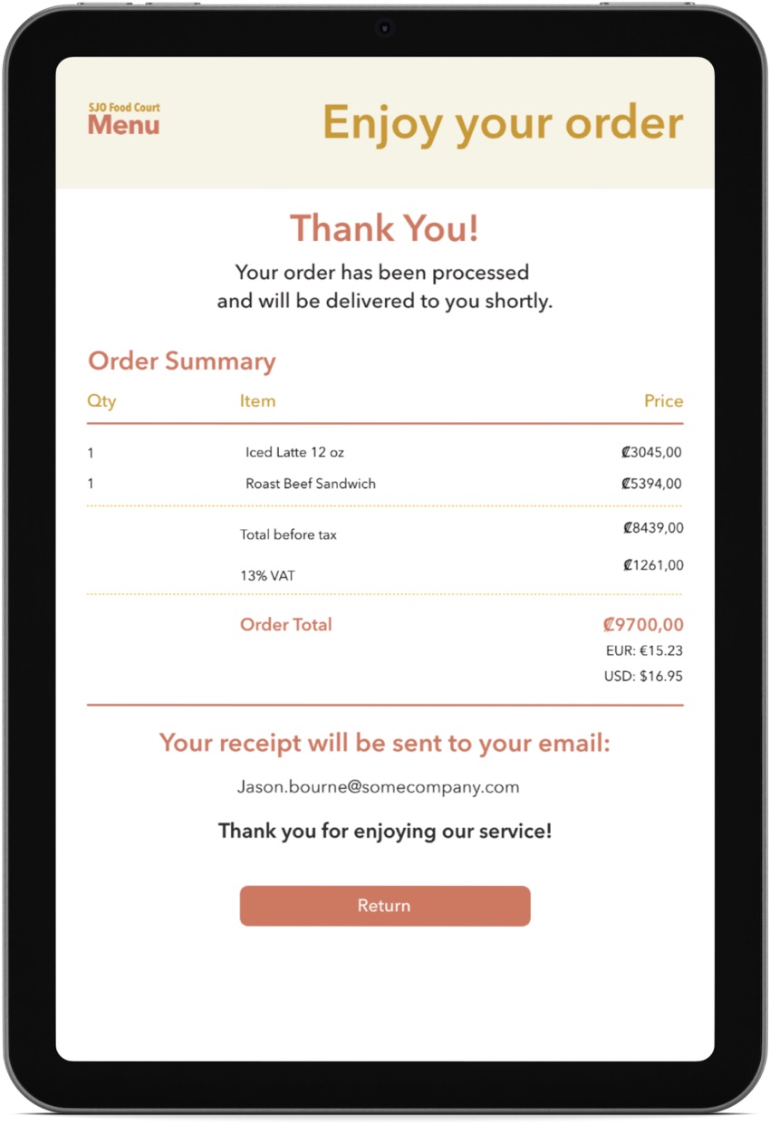
The user could have a copy of the receipt emailed providing an email address — which in turn could be used for the travel retail’s marketing promotions and loyalty programs.
Please Note: Additional samples of UX work made during this period, including video demos, are available upon private access request.
Lessons Learned
As this project didn’t move beyond a concept phase, I regrettably lack information on how this would have fared with better, in-place customer feedback. However there are some points that, in retrospect and as I have mentioned earlier, that I would have addressed in a different manner design-wise. Specially at the points of checkout, invoicing and payment. Still, when I designed this interface I did it with the idea of reducing all possible distractions at these points, and delivering an intuitive experience with the resources we could count on at the time.
Another field worth having tried was that of showcasing relevant promotions for each specialty, in a visible, eye-grabbing way. This would help many customers make faster decisions, and restaurants to better dispose of existing stock rotating product for more freshness and availability.
I still think that this idea can be improved in practice and scalability, specially in huge airports where your favorite meal choices won’t necessarily be next to your boarding gate, and don’t have enough “killing time” to stroll around before catching your flight, or want to take out some food post-security on the plane. There are plenty of variables to be considered.