UX Case Study:
Alzamon.art illustration portfolio
Overview
Besides performing professionally for about two decades as an UX designer, my other main career interests even before attending Arts college have been character design, illustration and animation, which I am still passionate about to this day. After a number of years using ready-made alternatives like Adobe Portfolio that always lacked an extra of flexible customization for me and feeling myself capable of assembling a whole site from scratch, I took on this project over several months while still holding a fulltime job as an UX/ frontend designer. Being a personal project, I consider it a work in permanent progress.
Goals
The main goal was to establish a site and branding in my very own terms, laid out the way I really wanted it to be, have complete control on how to display the content and using the most of my front end knowledge to develop it. Another goal was to establish a base for the Alzamon brand I adopted for my artistic ventures (although it is really a pseudonym, one that I use consistently across social media channels)
Challenges
The challenges with this kind of project, for me, were more technical than conceptual. More around the lines of the technical route to choose — I used Wordpress extensively in the past for my personal sites but I considered it to be too bloated for this task and didn’t want to deal with database maintenance. On research I found out about Jekyll, a flat-file, Ruby-based CMS that is promoted for text-based blogs but felt it could suit my purposes. Still, I don’t know of any other artist portfolio sites assembled in Jekyll so I took a kind of outsider approach. Being able to control the code output of the site via templates also meant I could fine tune them to perform well on search engines and social media adding custom Open Graph meta tags.
Target Audience
This being a personal project I used a rather loose definition of target audience, however centering it around the following types:
- Western (occidental) audiences 25-65 years old, associated with the trades of children’s publishing, illustration, animation and art in general.
- Art directors at publishing companies and studios
- Editorial directors at publishing companies
- Animation studios looking for character design specialists
- Art enthusiasts in general
Scope and Constraints
Given that this was going to be a one-person job for everything (me) the constraints faced were of the type on how to make every development step as efficient and quick as possible. There was also an initial learning curve to the Jekyll CMS which could impact the overall speed of it. For development, I chose frameworks I already had experience with on my day job (Bootstrap, Isotope, Lightgallery) to speed up the development process.
Personal Roles
Everything from initial concepts to custom development (HTML, SCSS, everything except premade Javascript libraries and frameworks) was accomplished by yours truly.
Design
It is often said that for portfolio sites the content (that is, the work displayed) is what makes the user experience rather than the site design itself, which in turn should be “invisible” to the user. However, content should always benefit from a clear, well-thought, intuitive design structure which helps the visitors locate their content of interest quickly and frictionlessly as possible.
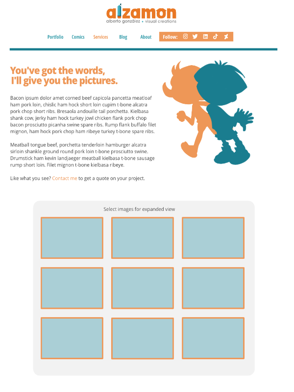
From the start, the idea was to not overcomplicate the structure. Define the site’s main building blocks (Home, Portfolio categories, Blog, About pages). However, prior to getting deep in code development I created an initial high detail mockup of the main (home) page to have a general idea of the design direction, color palette and others to take.
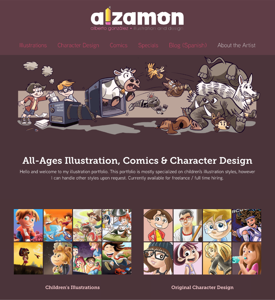
First website prototype circa 2016, with artwork specifically created for it.
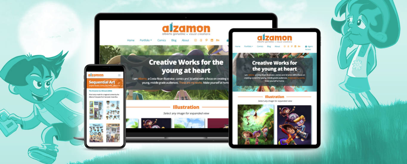
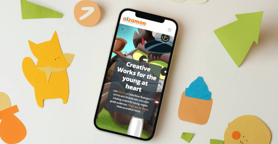
The initial iterations of the website, around 2016, featured a mainly dark palette rich on red and violet hues. This however proved to be too heavy and oversaturating for artwork display, so I went in the opposite direction for the next design iteration (2020) choosing a light palette with white background and centered in two complimentary accent colors (teal and orange). This allows the design to stay fresh and give priority to the artwork as intended.
These captures corresponds to the second design iteration.

As both header and footer components are reused through the site, the rest of the site shares a very identical design with minimal variations, determined mainly by content (portfolio, blog, etc). This was intended on purpose, as the design also had to be responsive to look and function equally well on tablets and smartphones, which goes in favor of simple layouts.


Later on, a password-protected “agent access” feature for WIP / NDA work was added under the agents.alzamon.com subdomain. This will become more important as my client work grows over time.
Lessons Learned
As I consider this a perennial work in progress, I keep learning lessons with each modification and improvement I make upon the site as I don’t see it only as an online portfolio but also as a branding and communication hub beyond the whims of social media, something that is becoming more and more important every day.
The joy of having a personal web site is that of allowing yourself to learn through trial and error what works and what doesn’t, and being “change” the nature of the Internet the definition of “what works” changes along with the audience’s tastes and habits.
When I can net a significant business deal out of this project, I may add it as a positive “result” on this case study, but until then it remains an organic, experimental playground, along with my illustration and character designer skills which I am always on the lookout to improve.