UX Case Study:
Cafe Britt - Britt Coffee Tour
Overview
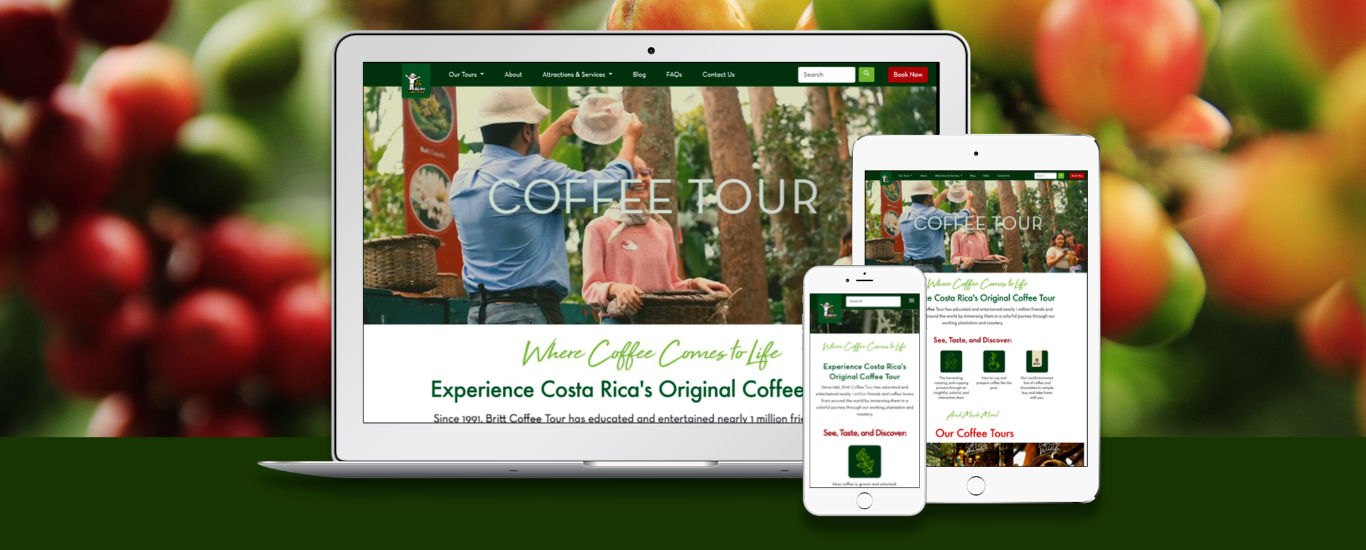
Cafe Britt — a Costa Rican coffee company that became known for bringing the gourmet coffee concept to Costa Rican consumers, started the first Coffee Tour offered to tourists and coffee enthusiasts alike in 1991, showing the entire coffee making process from plantation to cup, within a both informative and entertaining mise en scene featuring professional actors.
More than thirty years later and despite many lookalike competition tours nowadays, Britt's Coffee Tour still leads the top-of-mind rankings of TripAdvisor, tour operators and tourists abroad looking for an in-depth insight into the world of coffee.
Problem
While Britt Coffee Tour has had a website since 2006, both the design and the technology behind it were quite outdated and in dire need of a development revamp to address the following issues:
- Ability to reserve online not available (international phone only)
- Website's SEO ranking, efficiency and awareness not being helped at all by the old design
- Lack of integration with the rest of Cafe Britt's business-to-consumer offerings though their online store cafebritt.com
Goals
- Implement ability to reserve tours online with payment processing included, something lacking from the old version
- Automate follow up from Coffee Tour's management to reservation customers
- Automate gathering of user metrics to the company's internal marketing departments for promotion purposes.
- Improve the website's SEO ranking, efficiency and awareness through a clean front end design based on standard web UI frameworks, built from scratch
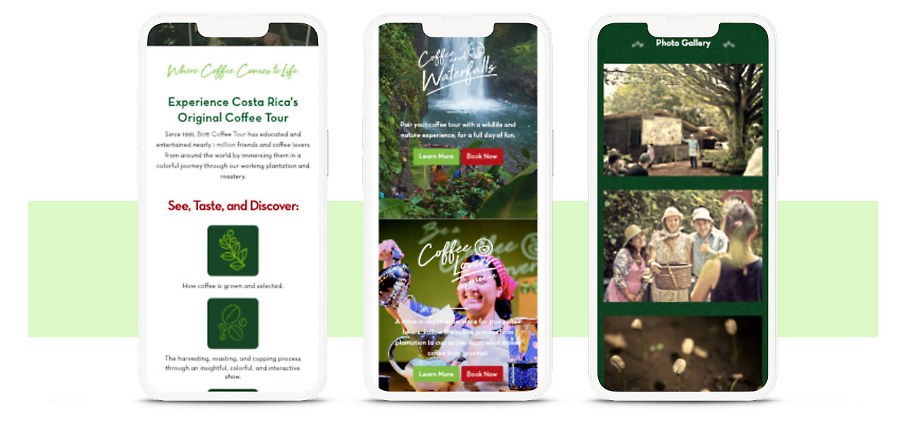
- Incorporate responsive design that made the website usable across the widest choice of browsers and platforms.
- Enable integration with Cafe Britt's business-to-consumer offerings through their customer loyalty programs, tour operators' coordinations and the cafebritt.com online store.
Target Audience
Tourists visiting Costa Rica who are interested in tasting and acquiring gourmet grade Costa Rican coffee, mainly from North America and Europe, in the 25-65+ adult age range and with middle upper class and above income level enough to cover a 2-week trip through the country.
Scope and Constraints
As all developments of Cafe Britt's digital properties are done in-house by a dedicated IT department, which is also in charge of the Britt Shop sales operations at airports worldwide, allowance of IT resources available for backend developments necessary for reservation and integration had to be coordinated weeks in advance. In the meantime, I was in charge of both UX/UI and front end coding development. Once a working, static HTML prototype was assembled, I also participated in the back end integration process to ensure the process results were shown to customers exactly as intended in the UX blueprints.
Personal Roles
- Research: Feedback collection from both Coffee Tour’s and Cafe Britt’s CEO and executives on received feedback from customers regarding the issues on reserving a Coffee Tour online and the expected outcomes of the website redesign.
- UX: Conception of process flows regarding prospective user’s gathering of information, selecting a tour, making a reservation, formalizing it and receiving confirmation.
- UI: Brainstorm redesign through quick lo-fi sketches, then build up final prototype on Adobe’s XD program to show Britt’s executives and development team.
- Front End development: Build website’s assets, images and branding through use of lean HTML, SCSS and the Bootstrap 4 framework with pointers for later use and integration of functionality by the IT team.
Design
As the core redesign goals to address the aforementioned issues were set in place:
- Make online tour booking a swift, no-brainer process
- Improve SEO, positioning and findability
- Internal integration of bookings with Cafe Britt’s sales and marketing departments
- Expand the Coffee Tour concept, establishing package deals with other tourist operators and offerings (Waterfall Gardens, animal rescue sanctuaries, etc) where Cafe Britt holds business or mutual interests.
Another set of design-oriented goals was also set in place:
- Revamp the concept and branding for the social media / smartphone era
- Make the website responsive / adaptable to the widest array of platforms
- Build the site’s coding from scratch, in a clean, modular and easily maintainable way. (As of July 2023, most of the design deployed in 2019 is still in place)
- Present key information about the tour concept in a short and to the point format, in a visually attractive way to pique interest on the prospective visitor
- Gather as many visually attractive resources as possible (fortunately, not a hard task thanks to the company’s marketing department) and decide on new colors, fonts and conventions to redo the tour’s branding. The final color palette was chosen precisely to convey the idea and feeling of a Costa Rican coffee crop — the colors present on it.
Anticipating User's Decisions
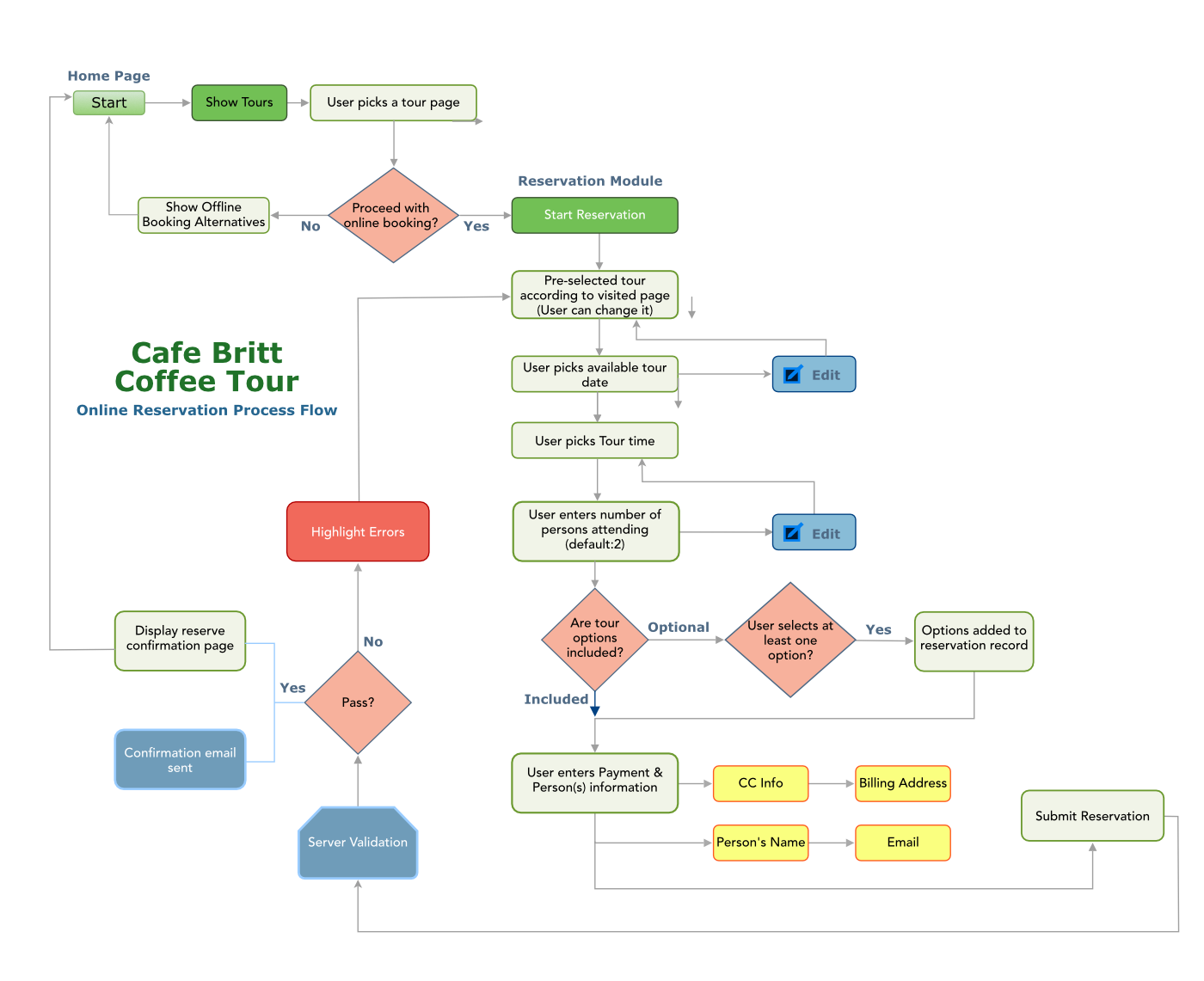
Considering that design in UX is the visual rendering of a solution to a problem, and the fact that identifying stress points on user interaction and addressing them is part of the route to solving those problems, a series of user routes had to be laid out to identify these stress points (and their corresponding solutions) more effectively.
Make A Moving First Impression
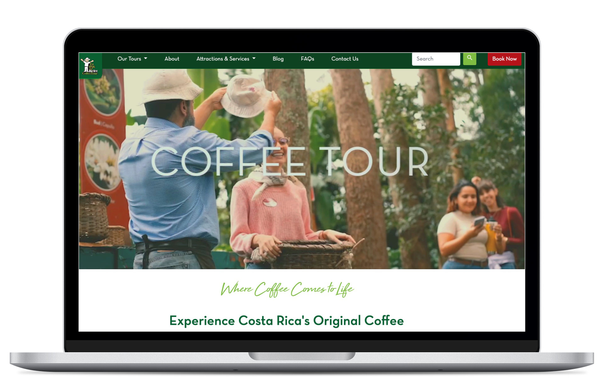
Considering today’s widespread availability of broadband, it was decided to include an enticing, looping short full-width video at the very beginning to show what the tour is about in a visually beautiful and stunning way, as to entice site visitors to explore further and book a tour.
Just The Facts
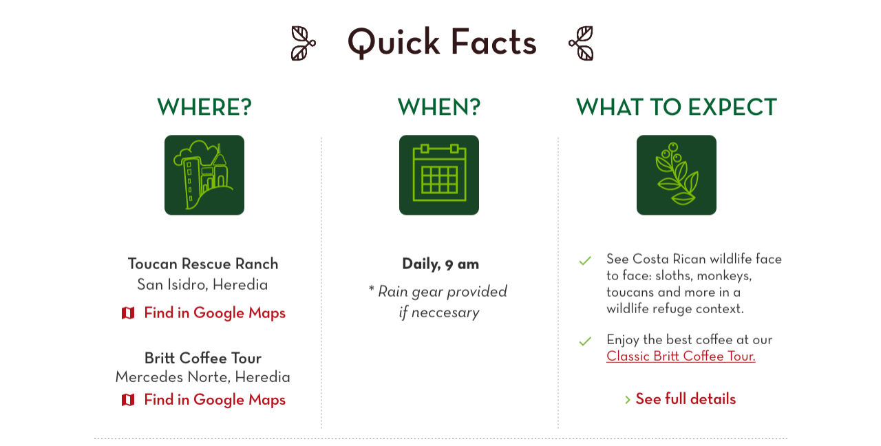
The goal on each tour page was to ease conversion from impressions to tour sales, so a combination of short, informative videos combined with obvious visual pointers on a responsive matrix (Where? When? What To Expect?) to quickly answer the main questions of visitors regarding the tour. Since an average foreign visitor won’t have an idea of where Cafe Britt actually is, a Google Maps location together with time/distance references from key tourist spots is also provided.
Don't Make Me Think (about booking)
Steve Krug's book title of what has become an UX classic is a perfect summary of the goals I strived to achieve on redesigning the tour’s reservation system, making it as foolproof, simple and straightforward as possible. Together with the IT team, a multipart reservation form was built dividing the process into four numbered, clear steps. A progress indicator is placed on top to inform the user of where she/he is in the reservation process and how much is left to finalize booking. Each of these steps is also back-trackable and editable, should the user want to change something.
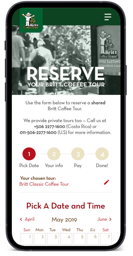
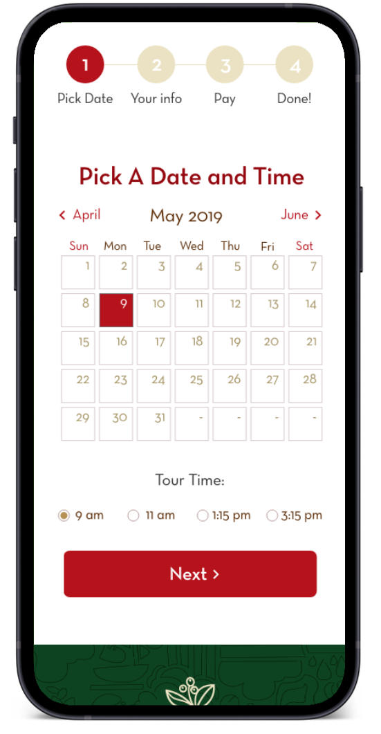
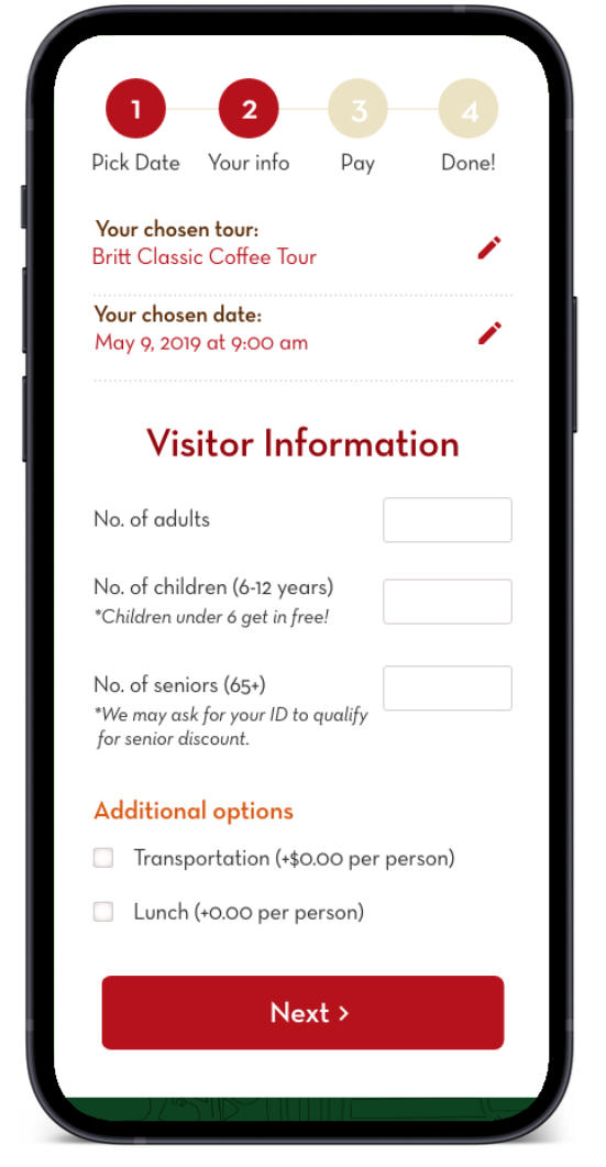
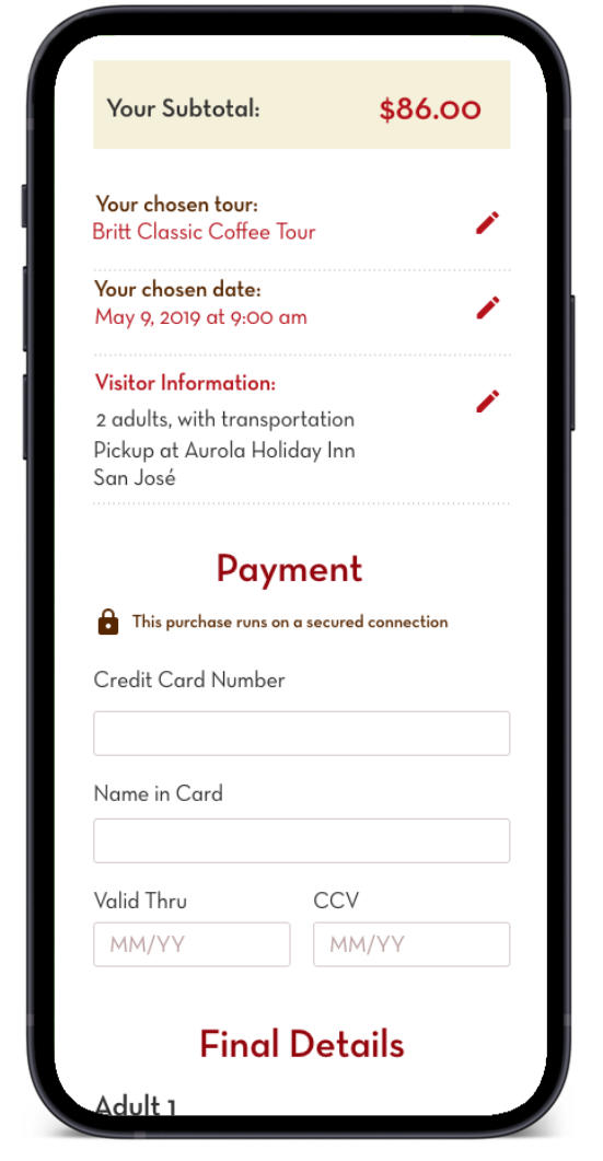
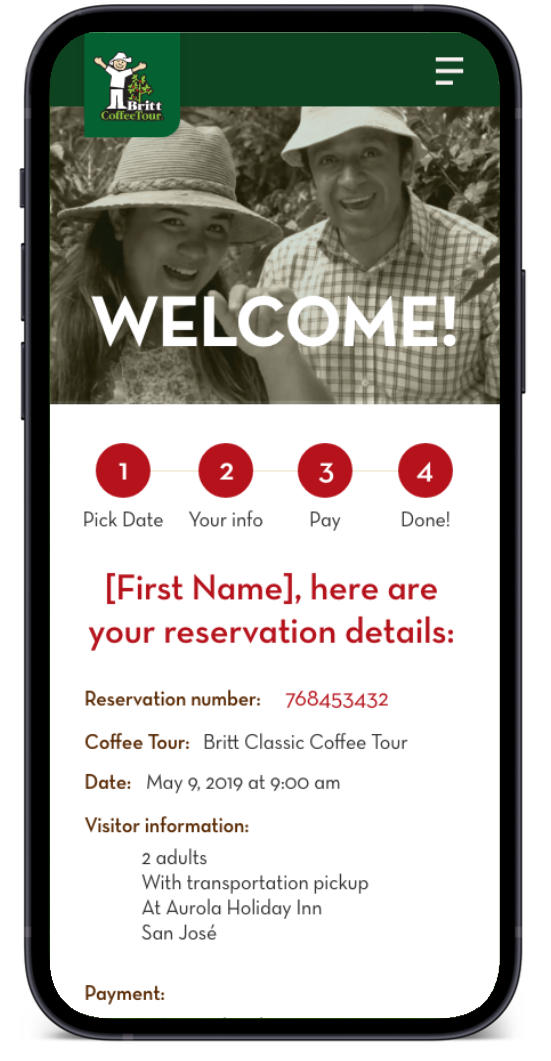
The most critical of these steps is the payment page, where it is assured to the user that the whole process is running under secure connections (using CB's established transactional online platforms). Dealing with the unavoidable verbosity of entering visitor names, emails and addresses was a subject of debate as this information is usually requested at the beginning of a purchase, but it was later decided to leave it at the payment stage as to approach the momentum of the action already set by the user (book the tour) and the fact that it is much less likely for the user to abandon the ongoing reservation process when he or she is about 75% of the way already, helping improving sales numbers.
Results
While precise numbers couldn’t be obtained from the company due to NDA purposes, gross analytics state that:
- Findability of the coffeetour.com website due to lean code and SEO optimization increased a whopping 62% in the 2019-2022 period. )
- Tour sales of both the classic version of the tour and combinations with other tours (wildlife rescue, waterfall sightseeing) have been steadily increasing in a gross 15% annual basis, since mid-2022 (excluding the 2020-2022 worldwide gap in tourism due to the Covid-19 pandemic)
- As of July 2023, Google search queries for both “Coffee Tour” and "Coffee Tour Costa Rica" on Google keep Britt Coffee Tour’s website on the first place of organic (non-sponsored) results, demonstrating the top-of-mind positioning and strength the brand has on their respective markets.
- While the Covid-19 pandemic of 2020-2022 definitely impacted tour availability, sales and profits, the website’s booking facility has helped spread Coffee Tour’s awareness and, post-pandemic, attendance return to pre-pandemic levels in 2023.
Lessons Learned
Besides taking care of an established niche brand in the market with a lengthy track record, the image revamping of the Coffee Tour brand was a chance to think both about preserving the core values of the brand and re-introduce it with a fresh approach and perspective to a younger, wired, self-serving and travel-enthusiastic audience. Tour packages combining the classic Coffee Tour experience with unique Costa Rican natural experiences appeal to a new generation of travelers with both a curious taste for unique flavors of the world and a shared concern of nature preservation and climate change impact, in an effort to make coffee production culture and sustainable tourism go hand in hand.