UX Case Study:
Traveler Rewards Loyalty Program
Overview
This project was done as concept and development prototype for a major traveler retail with airport operations across Latin America. For confidentiality reasons all traceable identities have been withheld.
Challenges
Looking to turn the client's most enthusiastic customers into long-term loyal brand ambassadors through an international incentives program, developing a mobile app to gather and manage user data was quickly decided as the vehicle of choice to move the concept forward. This choice wasn’t without its own set of challenges — customers not inclined to download or use the mobile app, not enough value perceived in the loyalty program to bother registering, or privacy concerns regarding user data. Therefore, a strong set of discounts, promotions and exclusive offers together with a clear, strong and transparent manifestation of data usage also became part of the deal to be designed around the app, and thus translated into pleased, loyal customers giving value to it.
Goals
- Enhance loyalty of existing customers
- Entice new customers through the added value of a loyalty program with access to exclusive offers
- Cater to frequent travelers, more likely to visit the shops on their trips
- Define, via GPS location, the best offers to show to users of the app in transit and thus notify them.
- Present coupon deals and discounts in an easy to dispose way (via self-generated virtual coupon books with corresponding QR codes)
- Make sign-up easy via integrations with Meta/Google SSO methods, alongside the typical user registration.
- Give the user an easy way to track their loyalty program points, available and cashed out redemptions, and edit profile data.
Target Audience
Frequent travel customers aged 25-65, traveling within the Latin American region airports where client's retail store operations are located.
Target Personas
Two persona prototypes were created for the development of this application concept.

Alex
- 45 years old male
- Married, two children
- Occupation: Business executive for international firm
- Travel Pattern: Regularly travels for business and leisure, both domestically and internationally
- Motivations: Seeks convenience, efficiency, and cost-effective travel solutions. Appreciates personalized experiences and is motivated by exclusive rewards that can bring in more convenience, efficiency and/or comfort in his frequent trips.
- Goals: Wants aggregated value from travel retail apps, purchases and offers, making them be worth his busy time.
- Pain Points: Limited time to explore travel retail options. With little time to stroll across the passenger waiting areas, between flight connections and security delays, Alex wants quick and easy access to relevant deals and promotions that don’t require a big deal of effort on his part to find — something the app strives to achieve via geolocalization, triangulation of data and on-screen notifications.
- Behaviors: Alex is used to travel apps to arrange all of his travel needs, from bookings to lounge locations to transport options. An app helping him to find on-the-go deals for his favorite coffee shop or exclusive discounts to take gourmet products home fits hand-in-glove with his traveler lifestyle.
- User Needs: A mobile app that is user-friendly, to the point, customizable, and allows saving time while giving access to exclusive rewards.

Emily
- 36 years old female
- Single
- Occupation: Marketing Manager
- Travel Pattern: Travels frequently for work and personal trips, prefers international destinations.
- Motivations: Be it for business or pleasure, Emily enjoys the thrill of finding great deals and discounts. She is more prone to act emotionally than rationally when shopping.
- Goals: Wants a shopping experience that appeals to her emotionally through the added benefits from a loyalty program whose points can be later exchanged for life-enhancing experiences, or a little cozy pause like stopping for a well-prepared coffee and gourmet sandwich at a Cafe Bakery on her way to the boarding gate.
- Pain Points: With so many choices and offers vying for her attention, Emily is in need of a system that can “read her mind” in a way, thus offering her relevant promotions and offers based on her app usage history and past purchases. In the creation of a very personalized profile through the application and the loyalty program, the easier it will be giving relevant recommendations to her.
- Behaviors: Emily likes to take note of all deals that catch her attention to act on them later, via writing a quick note on her phone, saving a bookmark, and collecting it all on a special app like Evernote, Google Keep or similar. Integrations with this kind of apps is something she can find handy on her daily routine.
- User Needs: An Intuitive mobile app featuring personalized deal suggestions, curated product recommendations, and an easy way to track loyalty program benefits that integrate seamlessly with her lifestyle.
Scope and Constraints
Working with an in-house development team, I was in charge of general requirements documentation and UX/UI prototyping. Front end development was decided to be based in Angular technology. I focused strictly on the UX/UI deliverables.
Personal Roles
- Research: Feedback collection from client's CEO, executives and key workers (store clerks, cashiers) on average customer shopping habits, their expectations and requests.
- UX: Conception of flows anticipating key behaviors such as user login / registration, profile consultation and geolocation-based offer notifications.
- UI: Brainstorm redesign through quick lo-fi sketches, then build up final prototype on Adobe’s XD program to show client's executives and development team.
- Front End development: As this was expected to be an app built in Angular JS and other back end dependencies, my involvement here was limited to export of graphic assets needed for the construction of the app
Design
Rather than think of a responsive web app, development was conceived from the start with the smartphone format in mind, thus speeding up the visual development in the best optimized way for the format. A minimal, utilitarian design route based on a limited color palette (gold, olive green, white) was taken from the ground up, relying mainly on established Angular front end frameworks and its expected output.
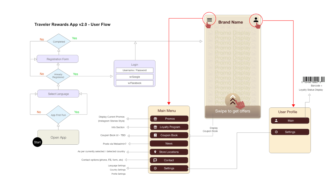
User Flow
The user flow charts were mainly created to address the application’s login / signup / main navigation processes, as the idea was to keep things as straightforward as possible.
Look and Aesthetics
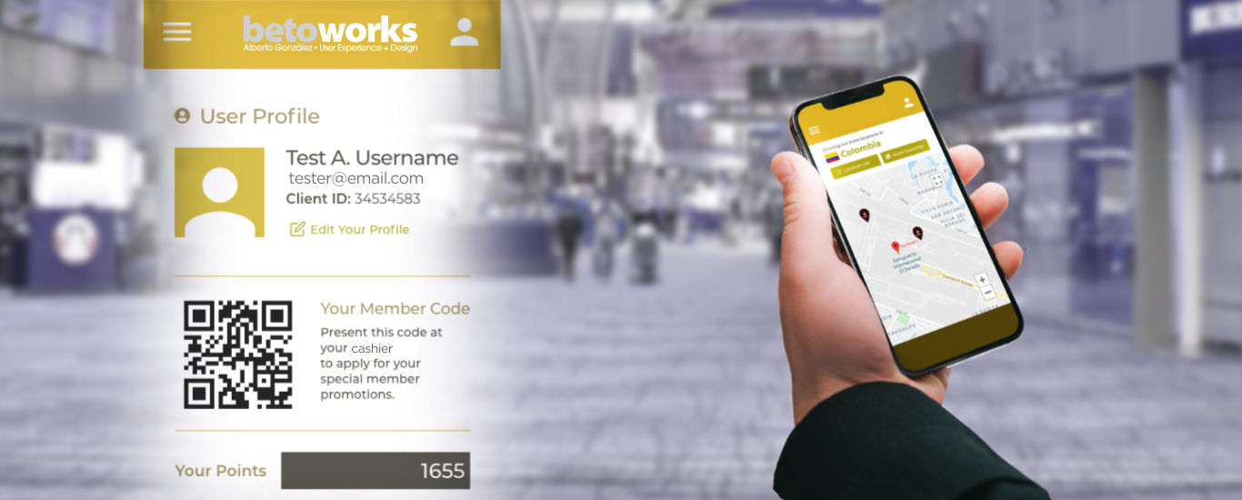
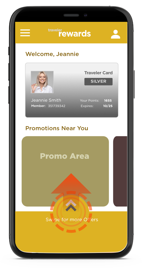
Upon sign in or registration, the user is presented with a virtual card featuring their registered member number, accumulated points and their redeeming expiration date.
Upon reviewing this design later in time, I think we could have easily gotten rid of the skeuomorphic credit card metaphors and simply display the user’s data along with accompanying info and the user’s QR code — which is the truly actionable item to be scanned by in-store operators, giving access to program-only rewards to the user.
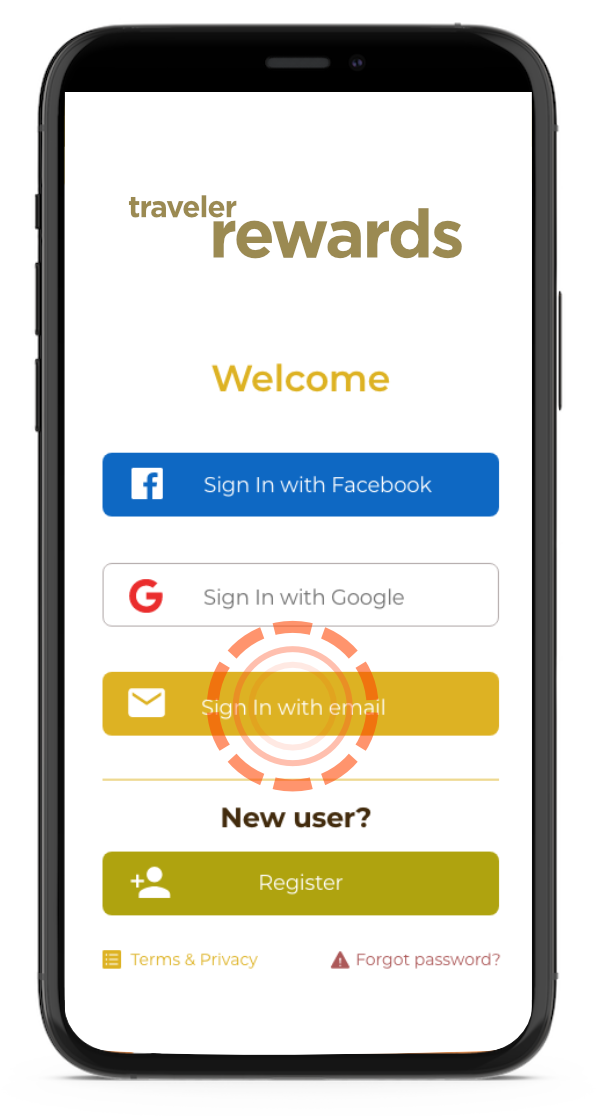
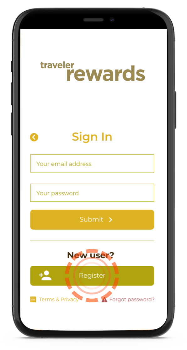
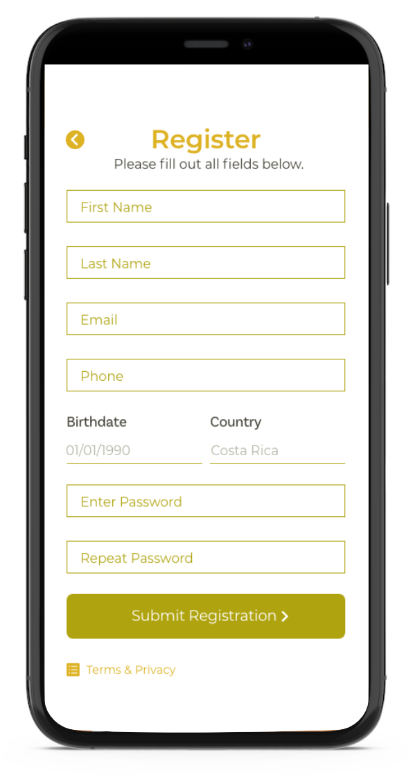
User Registration
From the beginning it was decided that user registration into the app should be as quick as intuitive as possible, making emphasis on presenting the user with a screen as decluttered as possible asking only for the essentials. Sign in integration with Facebook and Google was also considered to further ease the sign in process on the user's part but this brought its own set of tecnhical challenges to implement with the rest of the system.
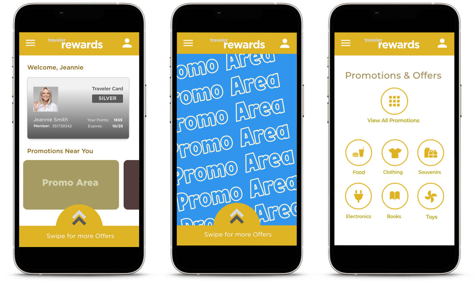
Promotions
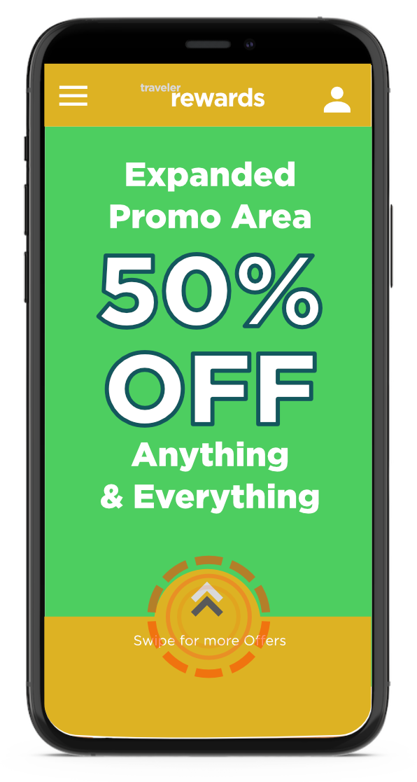
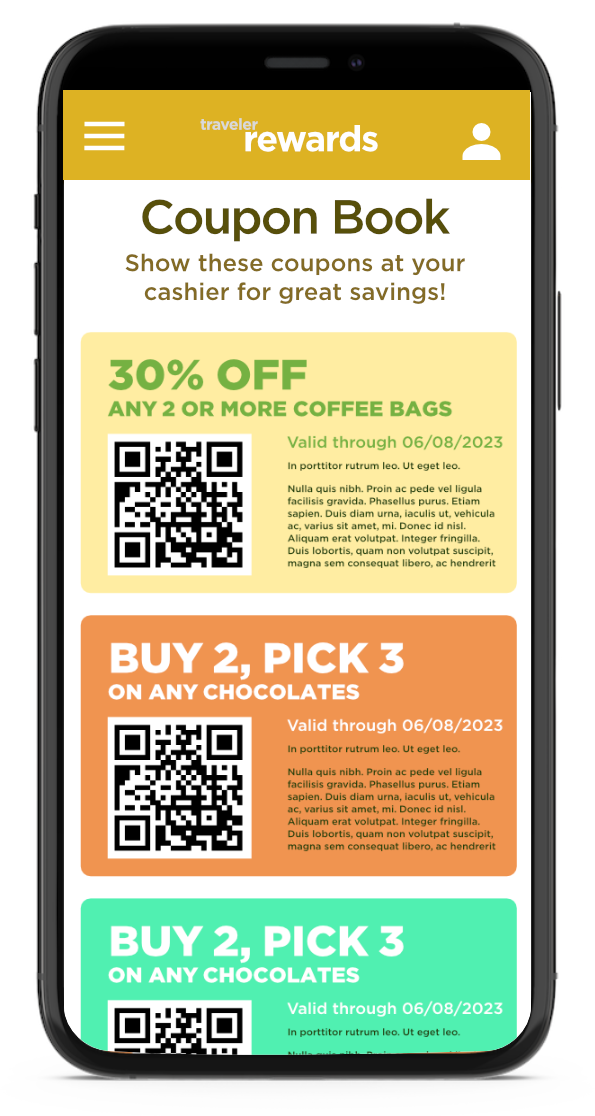
The app features two promotion tier types: The main tier at the user’s dashboard screen (pictured) with scrollable thumbnails that, when tapped, give way to a rotating carousel featuring designs for the latest promos on the zone where the user is currently located, and a second tier of actionable promotion categories where ongoing / less recent promos can be accessed by the user. These promos are accessible via user tab swiping, as shown here.
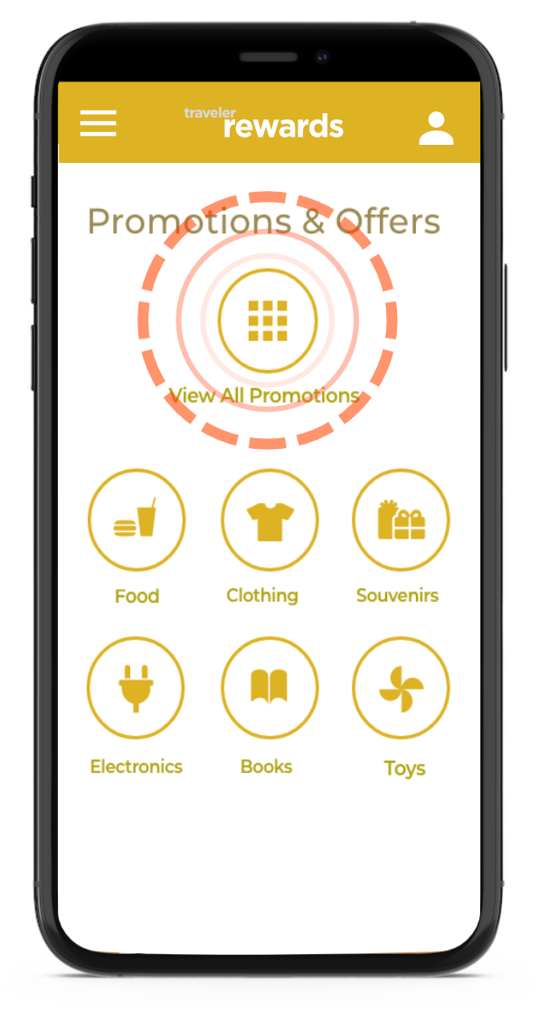
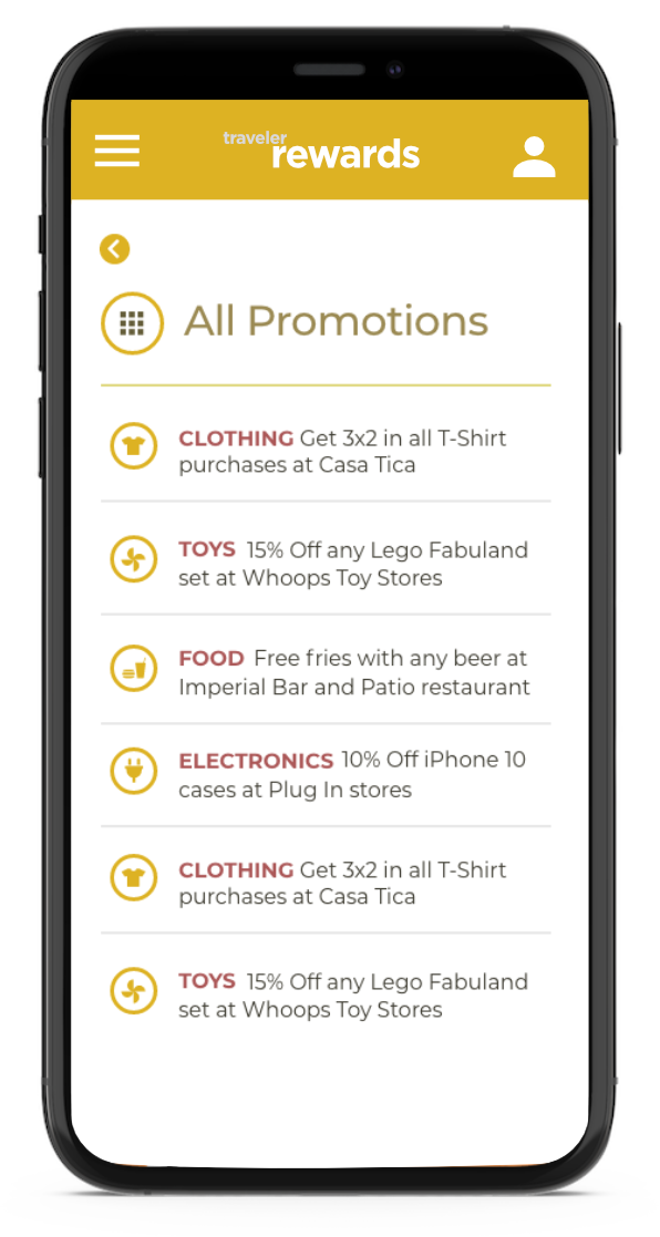
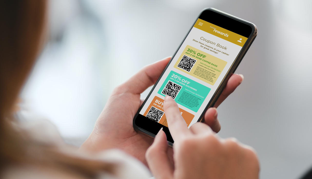
When applicable, these promotions could also be linked to a coupon book displaying current “promo cards” featuring an actionable QR code redeemable via on-store cashiers (As for app projections to be accessed from user’s smartphones within a physical store context. The discount or special offer would be made effective upon validation of the QR code by the client's POS system)
Geolocalization
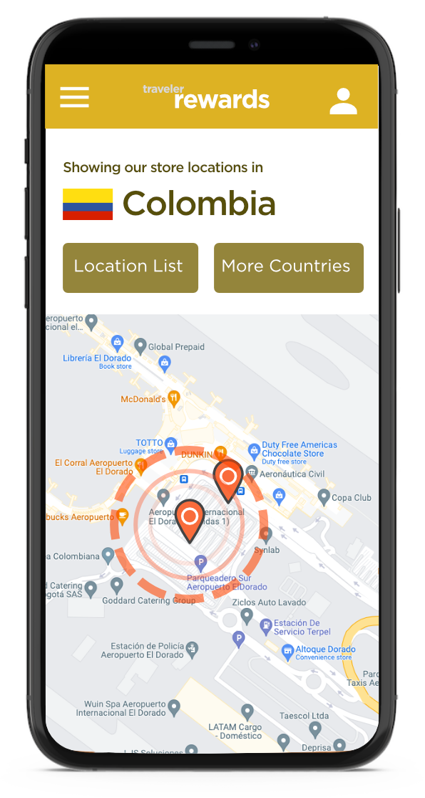
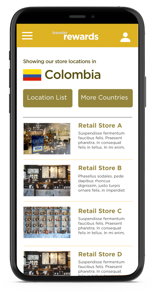
This was perhaps the most ambitious part of the project. The idea being to auto display relevant promotions to the user depending on their current geo-location — with the user’s GPS data obtained via the airport’s open Wifi services. Thus the user would be notified, on location, of the available offers in the premises. Equally, the user could also select any other country at will and peruse their available promotions.
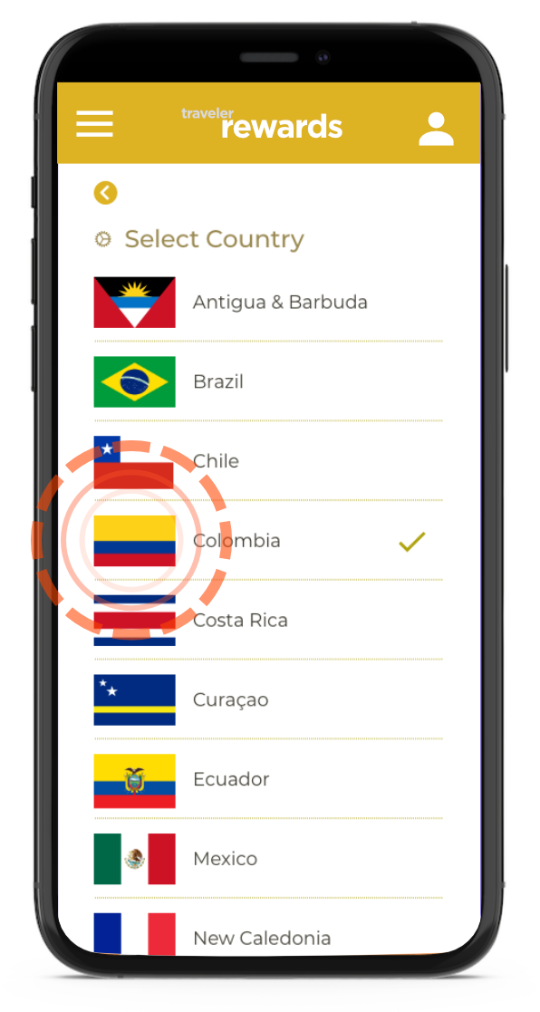
While app screens were designed for these stages, the requirements from both iOS and Android for location services to be opt-in only reduced the chance for this to be, while it could understandably constitute an unauthorized security breach.
Results
While this project was in the works to be further developed during 2020, the Covid-19 pandemic and its undeniable impact on the travel industry halted further development on this application, so all possible results are theoric.
Please Note: Additional samples of UX work made during this period, including video demos, are available upon private access request.
Lessons Learned
While the rewards program was something that had a lot of potential to be further developed, the unforeseen circumstances of the global 2020 pandemic left this project on a “what if” phase as development resources were relocated to other better-suited projects given the circumstances. Still, working with a very focused need from the client (increase sales in stores through a growing loyalty program) gave me a new set of challenges to address a series of problems and goals to be solved and achieved via planned design, without making the whole deal unnecessarily complicated given the fast-paced context this application would likely be used (on a quick stop before heading to the boarding gates). More time exploring the likely persona types for this application would have been also appreciated.