UX Case Study:
Morpho POS UX Redesign
Overview
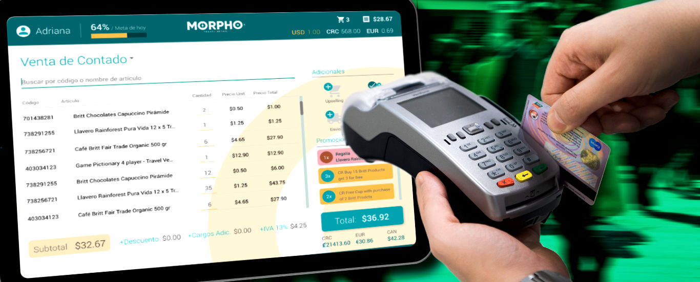
My first assignment for Grupo Britt was to redesign and improve their existing cashier POS system in use at airport stores, restaurants and other properties across Latin America. Their POS system was built in-house (up to their special requirements) and yet it was still too cryptic and not too user-friendly for newcomers into the system. Therefore they requested a more user-friendly UX proposal.
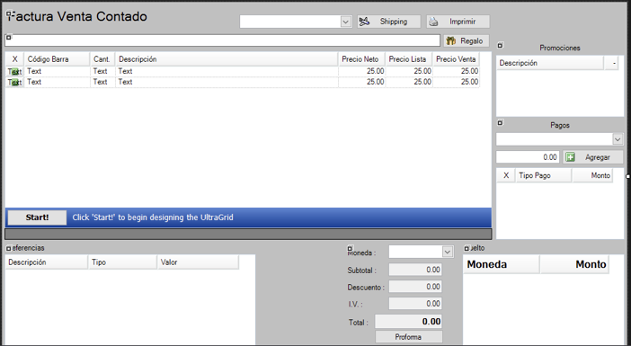
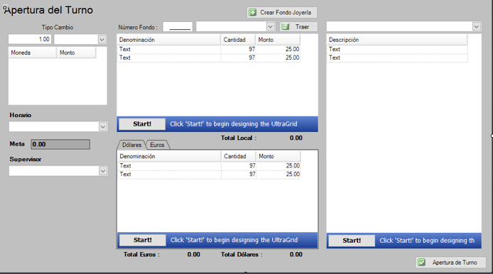
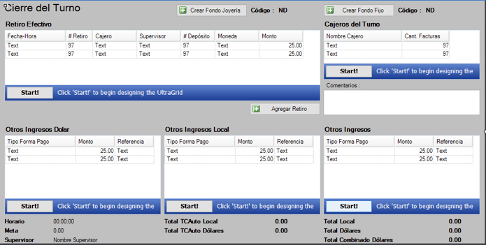
Original POS captures. User-friendly design wasn't evidently a priority.
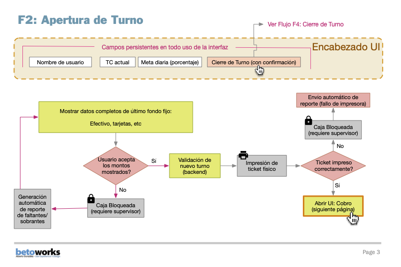
Having a visually-oriented rather than a code-oriented mindset, upon client feedback and back-and-forth sessions discussing their needs and usage of the application, was how to interpret their existing process flow infrastructure and improve upon making it as user-friendly as possible.
Process Flows
Getting myself acquainted with the POS system itself was essential, as well as identifying persistent vs. temporary fields and grasp the logic between transactions and all its possible variables, while attempting to translate the accountant lingo across the application into something more globally understandable.
Note: Spanish was used as the default language for all digital assets since the client's headquarters are in Costa Rica, a Spanish-speaking country.

Design
As the Morpho Travel Retail line already had a line of established brand colors, those were incorporated into the final design. Materialize (based on Material Design system) was used as the front end framework.
Given that this was an application to be used on an intranet of standardized computer requirements (standard computers dedicated as POS terminals) no further adaptations to responsive design or multiple browsers were needed.
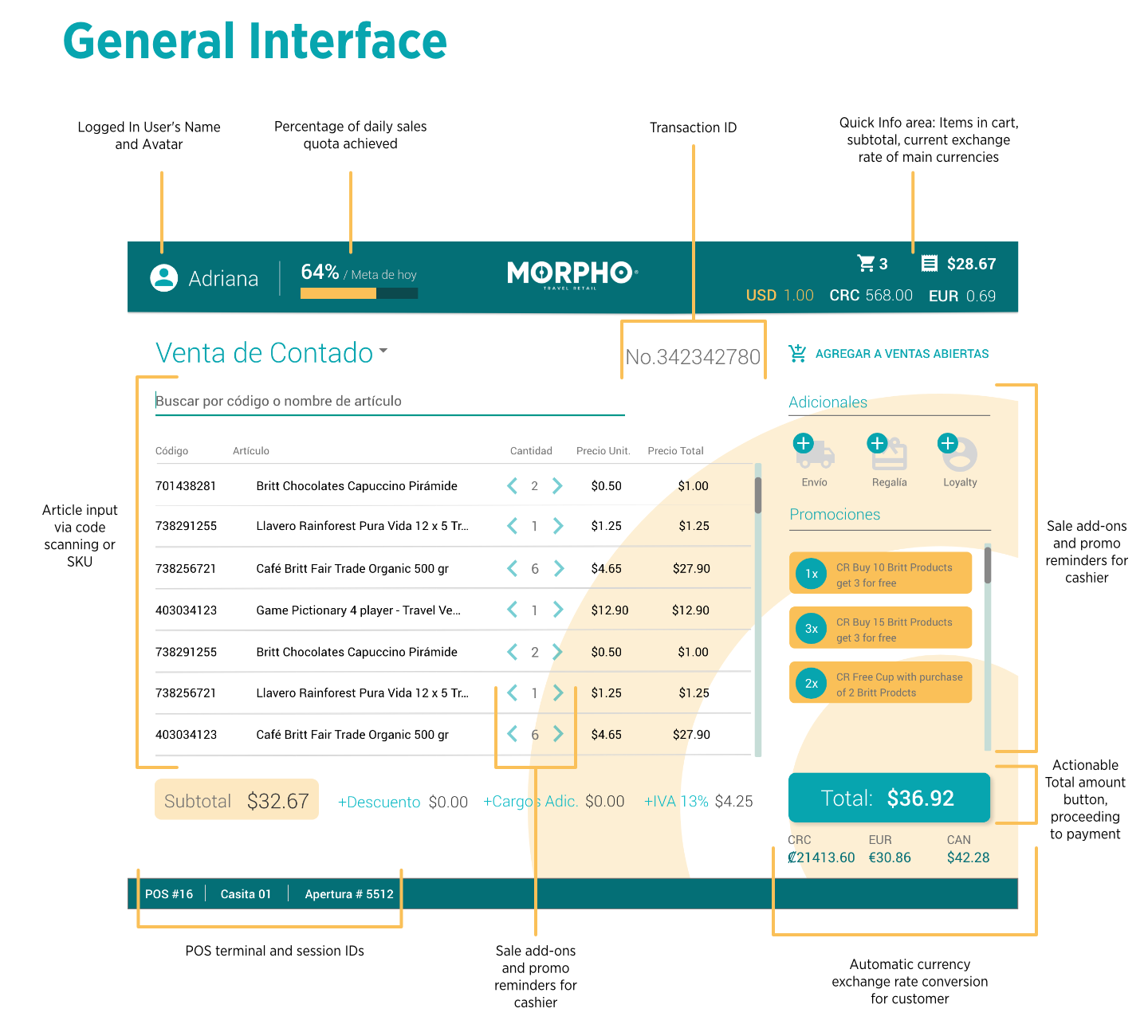
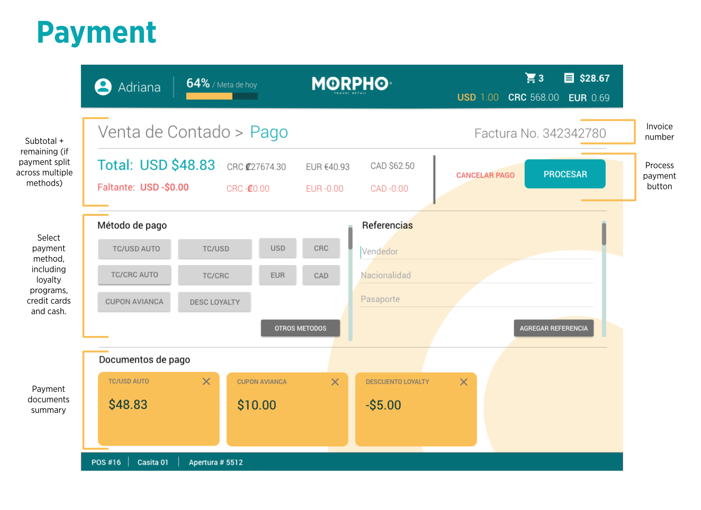
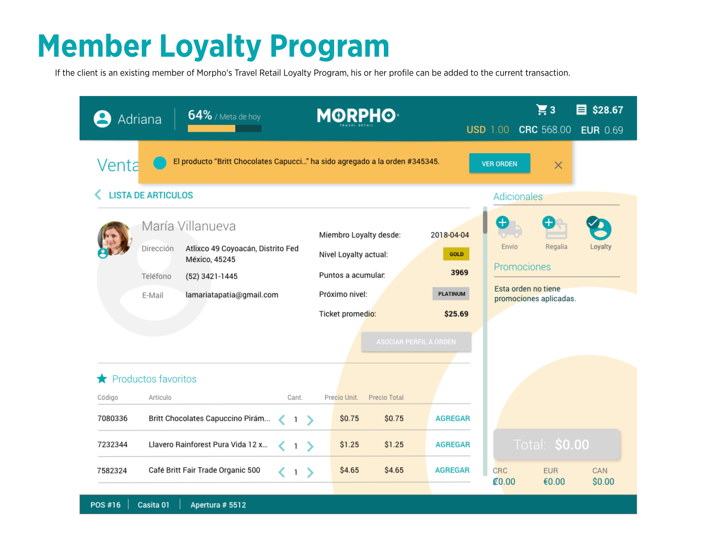
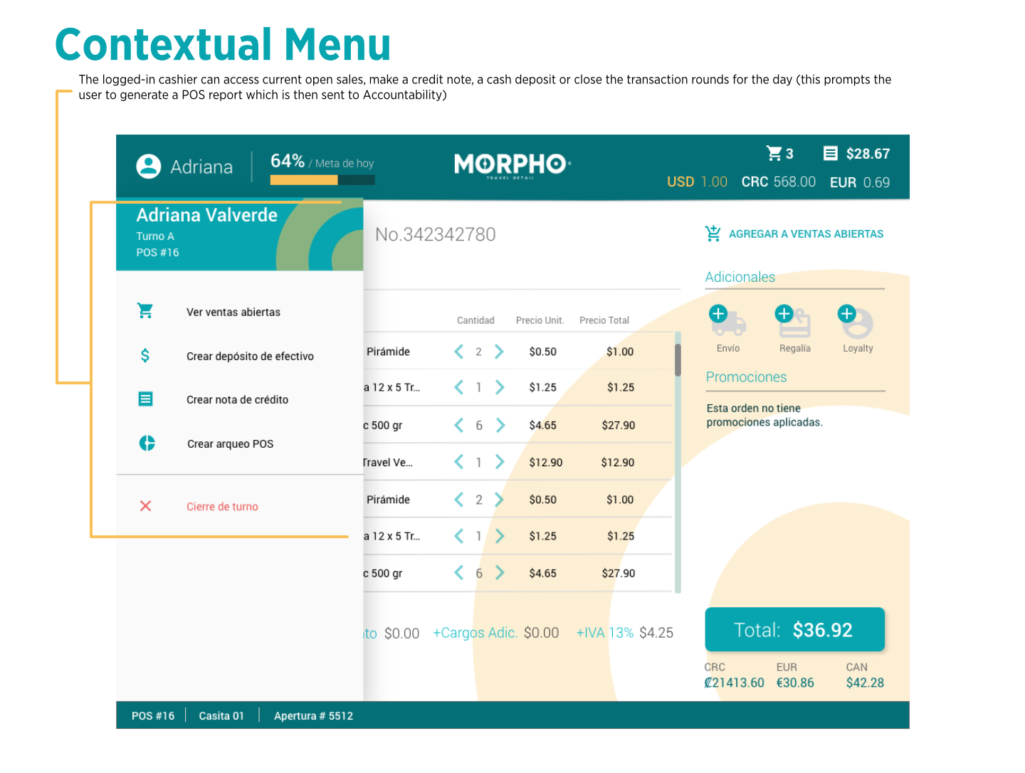
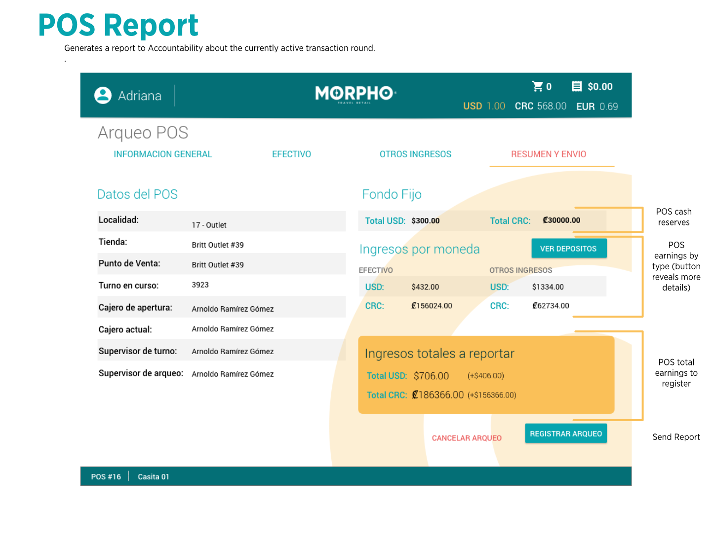
The following is a walkthrough of the UI through their most key UI elements. This is not an exhaustive list as there are plenty more screens related to more complex POS operations but for porfolio purposes I hope these will give you a good idea of the overall reach of the app.
Video Demos
Conclusions
Being able to participate in this project allowed me to have a good grasp of the general performance and structure of a custom POS system, and the level of attention and responsibility involved on creating a user experience flow aiming to reduce the level of involuntary user and accounting errors as much as possible while also providing an user-friendly interface that anyone can get him or herself at home rather quickly.
Initial performance reports of actual implementations of this new interface brought in KPIs of up to 40% decrease on cashiers' input errors, thus streamlining in-site customer sales processes.