UX Case Study:
Menturia.com Education Platform

Overview
This is a development of UX documentation and prototypes for Menturia.com, a regional (Central America-based) education platform targeting high school students about to choose their college studies and/or work careers.
Challenges
These were more on my part of understanding the client's goals and philosophy involved in the conception of this project. Having had a successful market positioning run with their main web project —an online directory of Costa Rican / Central American colleges, universities and their career offerings—, the purpose of Menturia is to first become an adjacent development to this main project and later offload the content pertaining to high school students to it, creating a separate market entity. The client also organizes dynamic orientation campaigns in leading high schools across the country, featuring the patronage of some leading consumer brands targeting the 13-18 teenage market too.
Goals
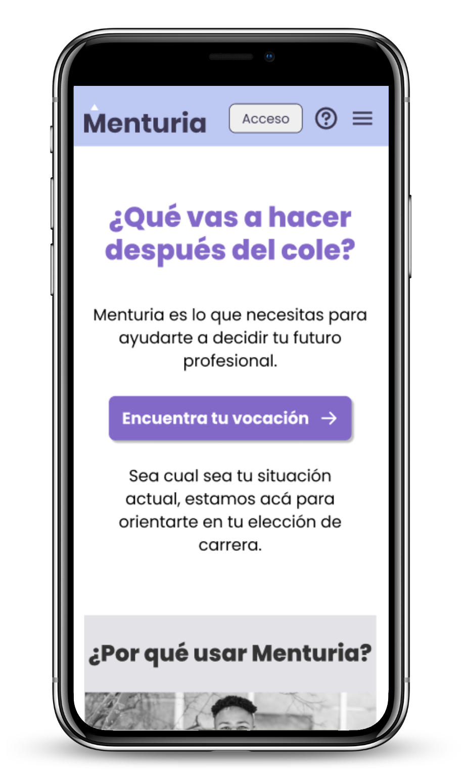
- Build an online resource fit for the needs and habits of today's teenage students, prioritizing smartphone usage by means of a responsive web interface.
- Provide a solid organizational foundation to manage and deliver client-made educational content in the form of course videos, study units, pop quizzes and additional study challenges presented in an attractive way.
- Address the fact that many students today lack an email account for user identification, favoring the integration with services they really use on a day by day basis like Meta's social networks and Tiktok via API connections.
- Create a self-service web application where the user/student can be able to monitor his/her own course progress, gather app points and thus rank higher among other students and colleagues, creating an environment of positive and motivating challenges.
Target Audience
High school / College students from the Central America region, aged 15-22. Further expansion plans include countries such as Colombia and Peru.
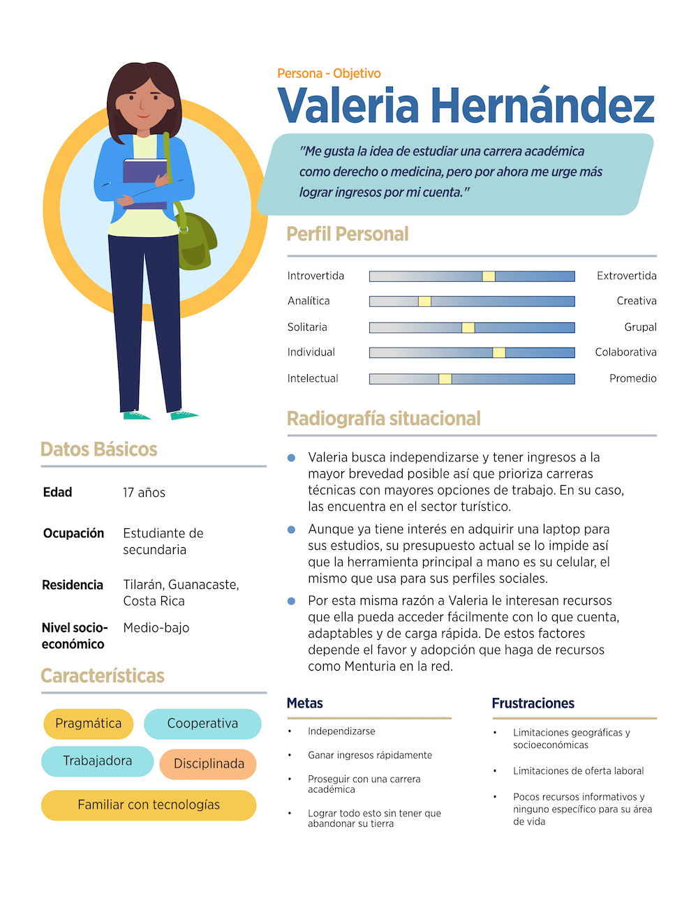
Target Personas
Two target personas were created for the project's documentation: show here is a sample of one of them (in Spanish).
Scope and Constraints
As it has proven customary for this type of project, I entered it as a freelancing UX consultant, therefore in need to get as much knowledge of the client and project's scope from scratch as possible, and from there start assembling the requested assets — documentation and wireframes. Further development would be carried on by their in-house team based on my guidelines. A series of subsequent meetings with the client and their associate educational orientators and career counselors were key in providing me with required information and answers to pinpoint the best possible approach from an UX perspective.
Personal Roles
- Research: Meetings with client, documentation guide production, back-and-forth discussion of wireframes.
- UX/UI: Conception of user personas, their user flows within the app, and the lo-fi rendering of the application's design and prototype in Figma.
Design
From the start it was decided that this web application was going to be more experienced and used by students on their smartphones, as this is the only internet-capable communications device most own at their age. Thus the prototype being built using an average smartphone's aspect ratio.
The client also provided me with a previous brandboard sheet stating the brand's visual identity and colors, so even if these weren't key to the lo-fi UX design approach where showcasing functionality was the priority, they constituted a helpful kickstarting asset.
This project also represented a refresh course in Figma personally, where I got quickly used not just to the new interface but also to advanced options like use of variables to make the prototype “smarter” without having to make so many of the typical “prototype spaghetti” connections to simulate performance.
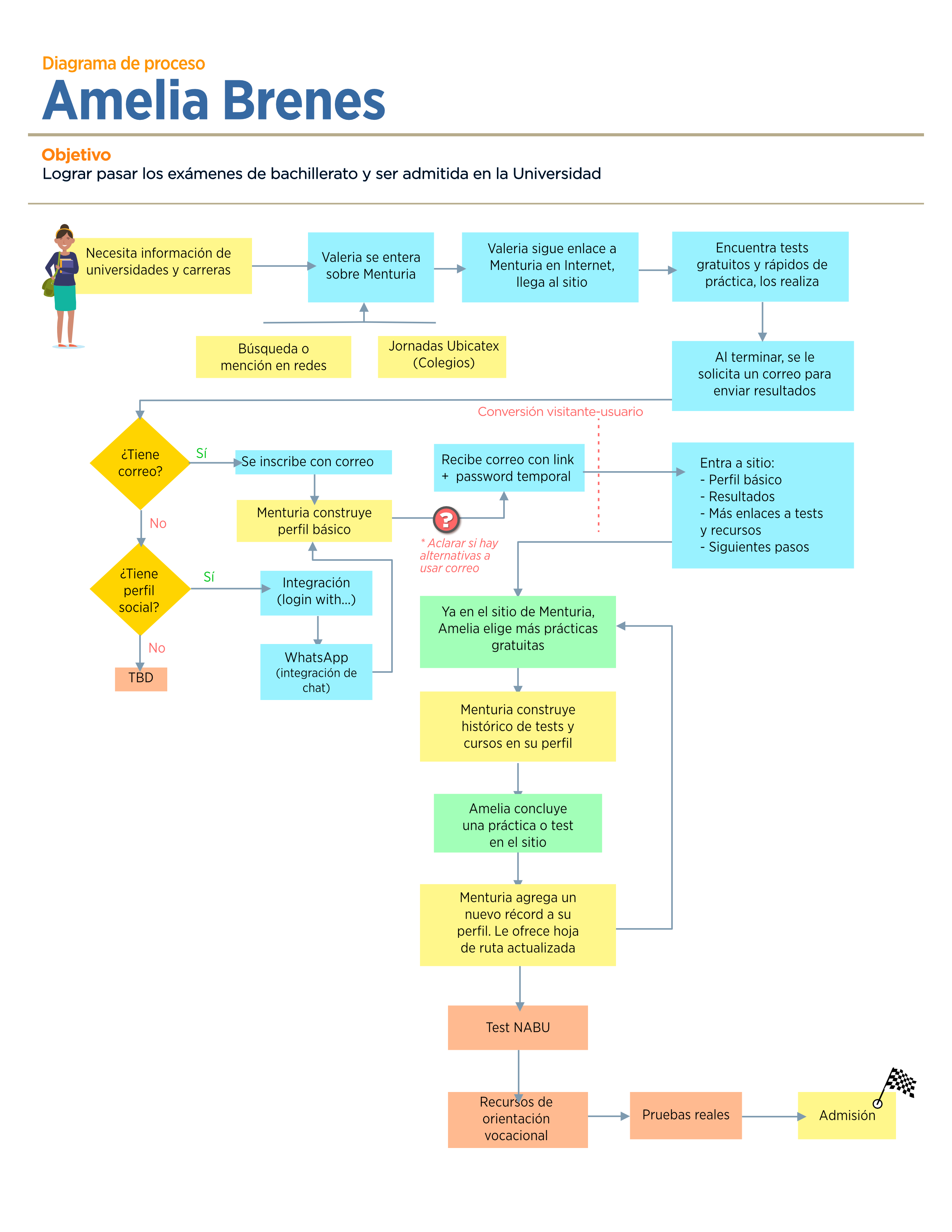
User Flow
The user flow charts were mainly created to address the application's login / signup / main navigation processes, as the idea was to keep things as straightforward as possible. (In Spanish)
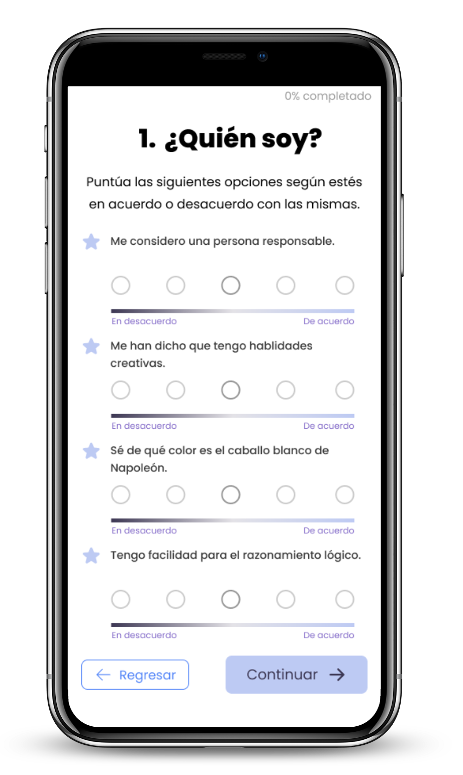
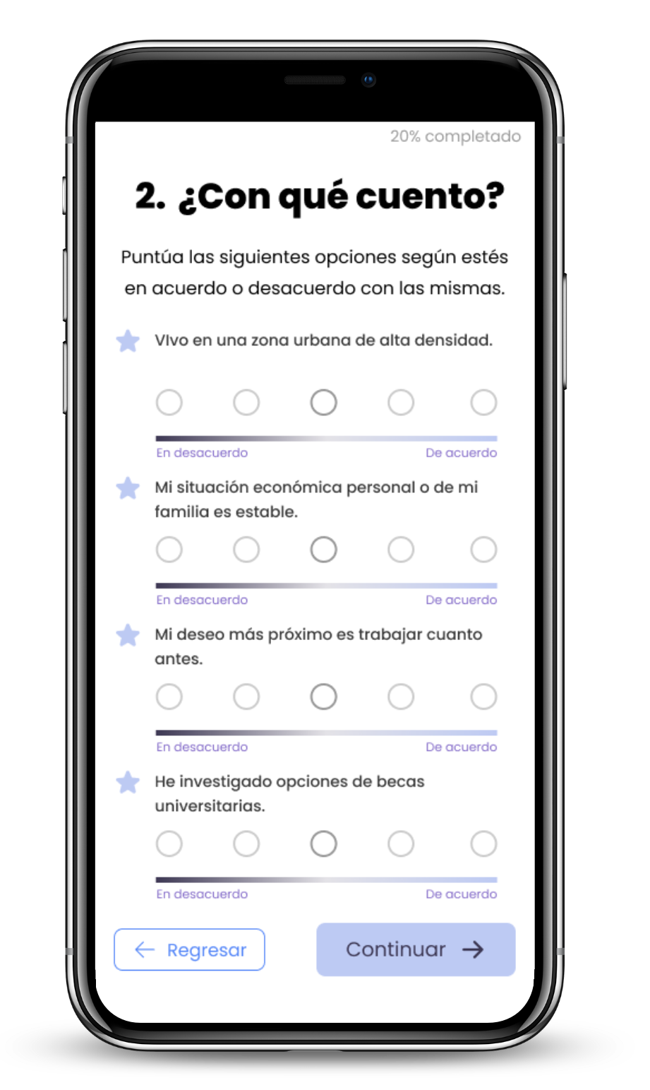
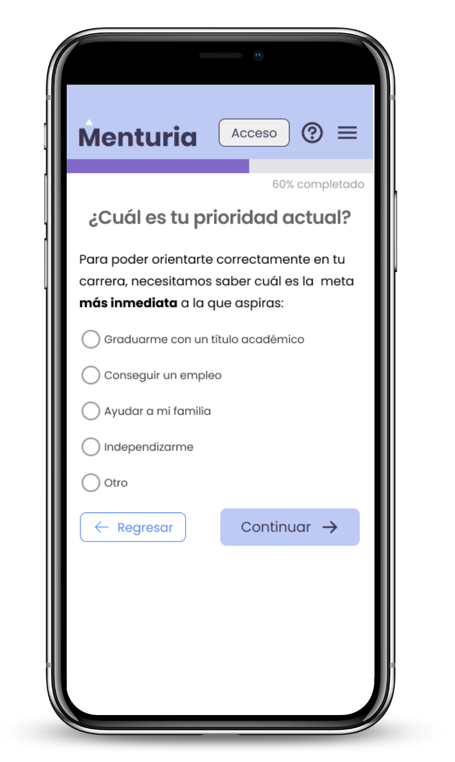
Self-assessment tools
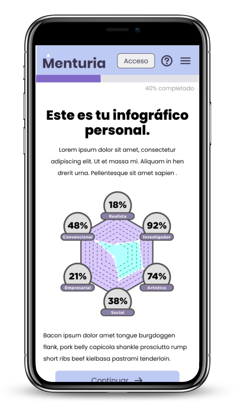
The mainly developed part of this project was a self-discovery tool to enable the student to find the answer to the "which should be my career?" or "what am I going to do after high school", considering some students may prefer taking a faster track to work experience in the form of technical training, rather than academic. Through a comprehensive list of variables, this quiz tool attempts to help the student with that answer, and the results become part of their user profile in Menturia.
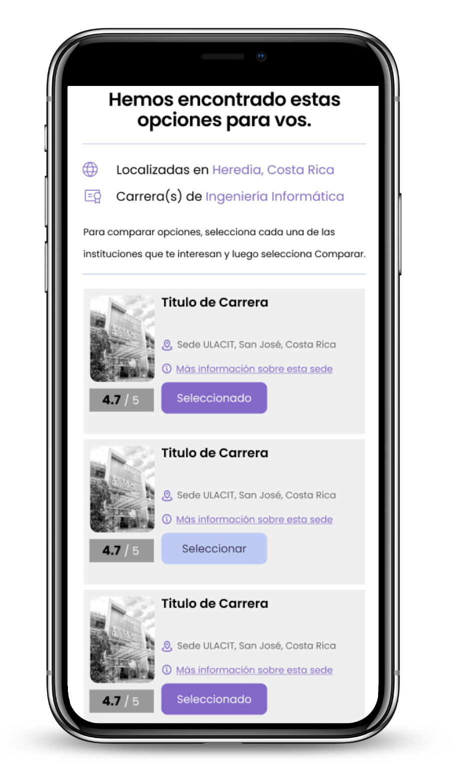
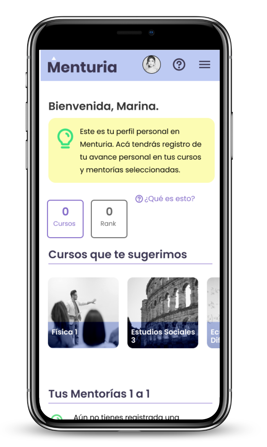
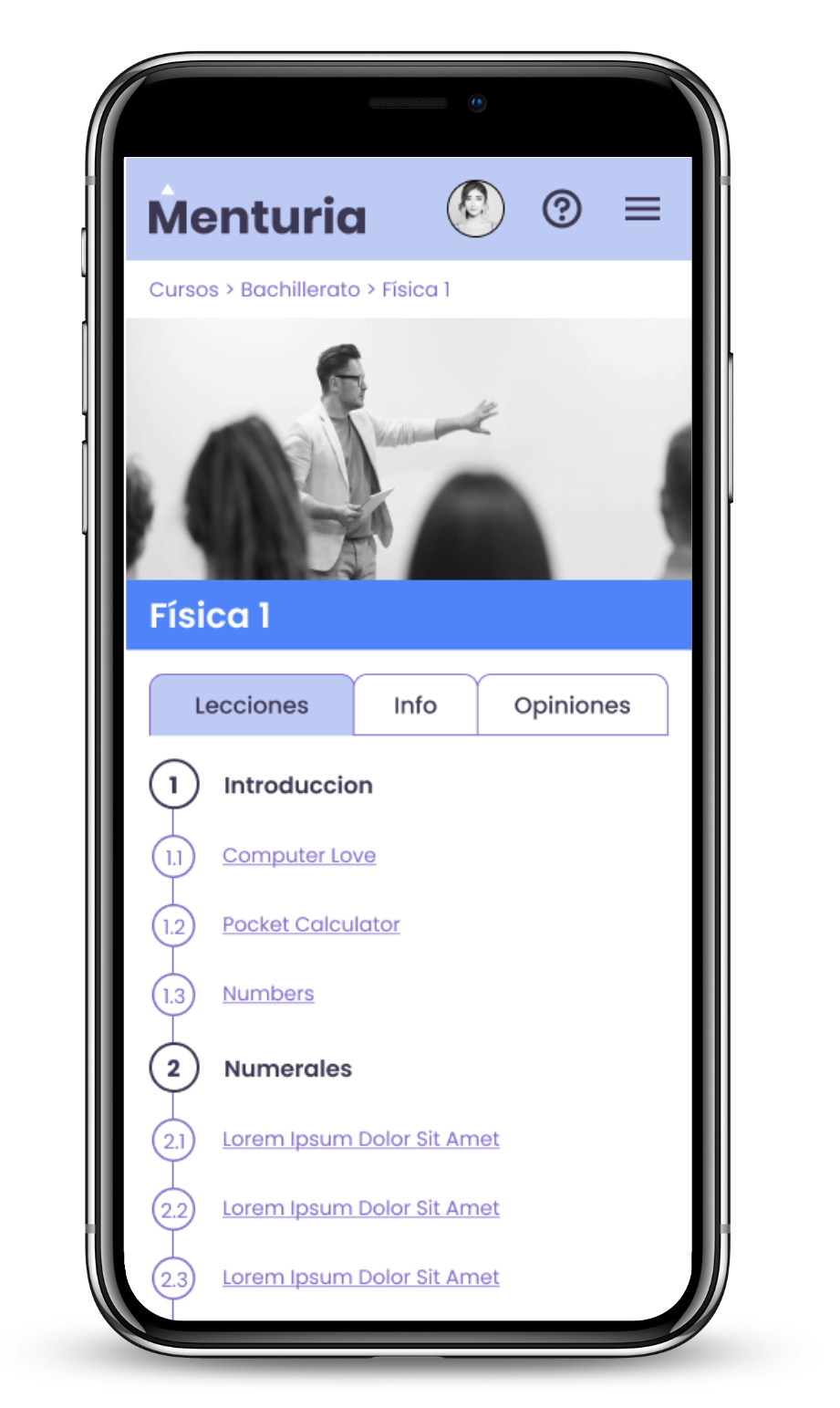
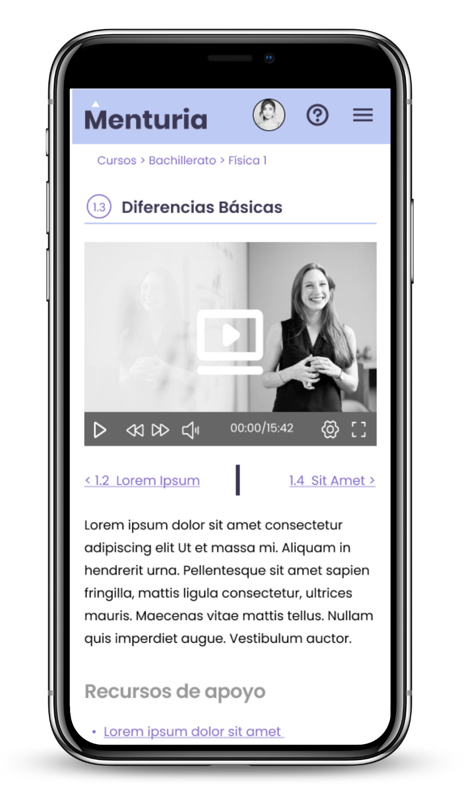
Personal Profile and Online Lessons
Video Walkthrough
Alternatively, you can view the Figma file of this project here.
Conclusions
Even as my responsibilities for this project didn't go beyond a freelance UX design consultancy, this served me to both have a deep insight on the current reality of the realities and challenges of today's young student generation, their concerns and aspirations. Also from a technical standpoint, this was a great opportunity to put myself up to date with the most advanced features of Figma, getting the feel and habit for the program after years of experience creating UX prototypes using Adobe XD, which is a decent tool on its own but in today's UX market, Figma has become the new standard and thus it made sense for me to adapt to it.